
Raylee Rice
PROJECTS:
Brand Design
Workbooks
Lead Magnets
Signage
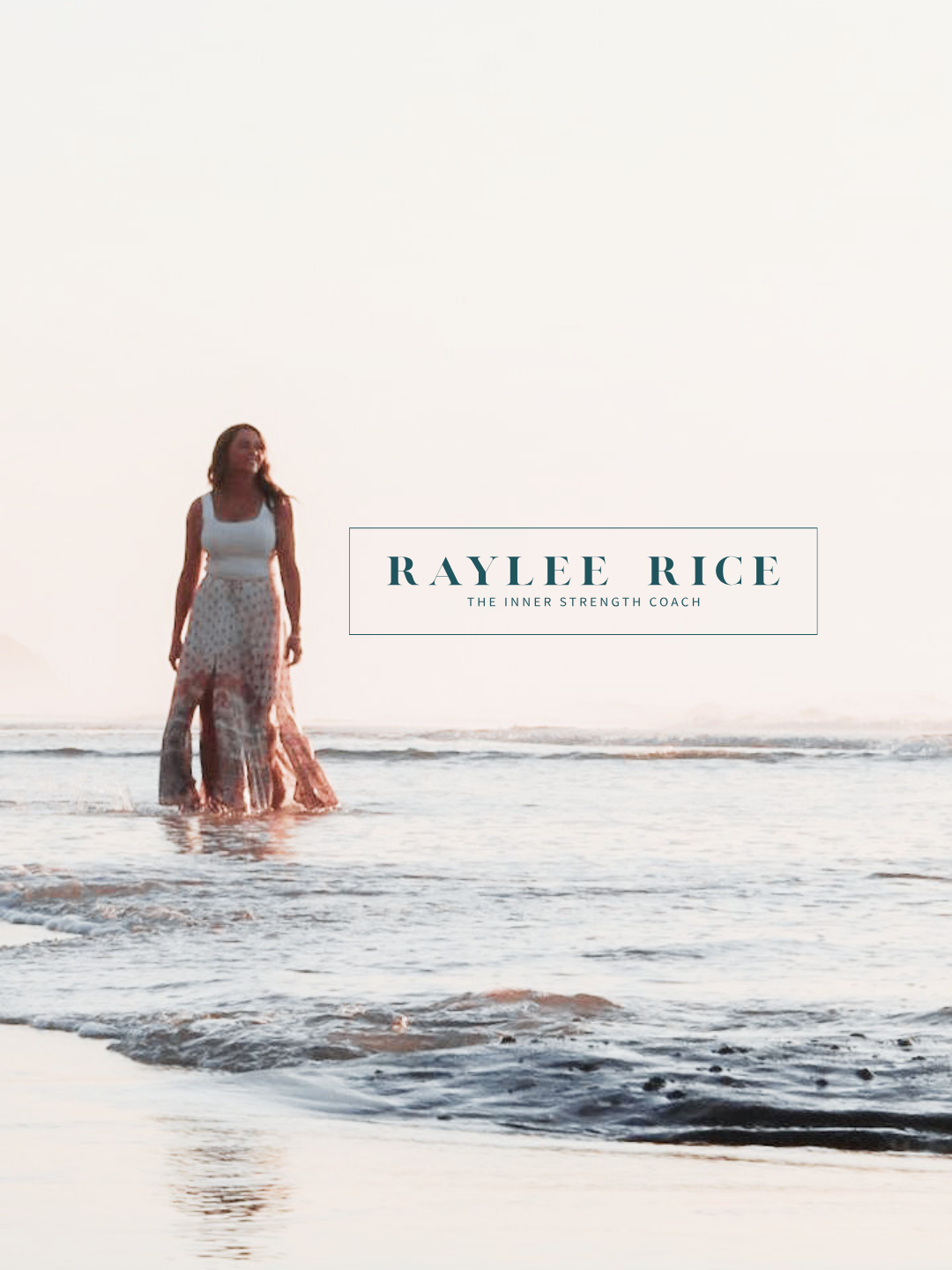
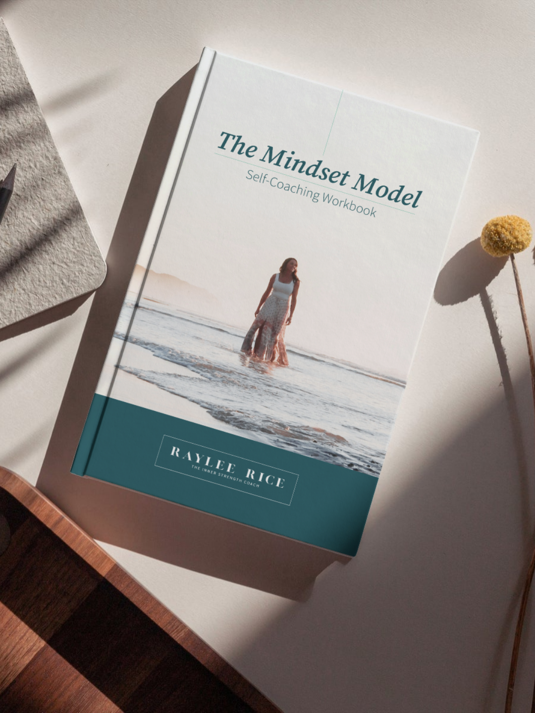

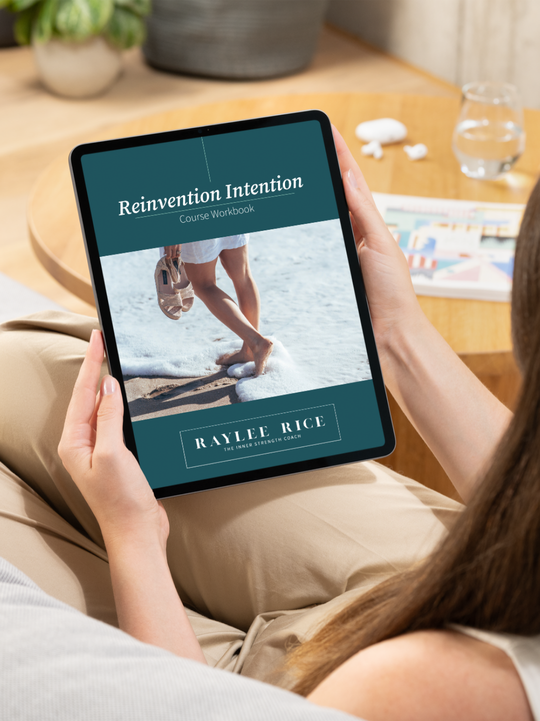
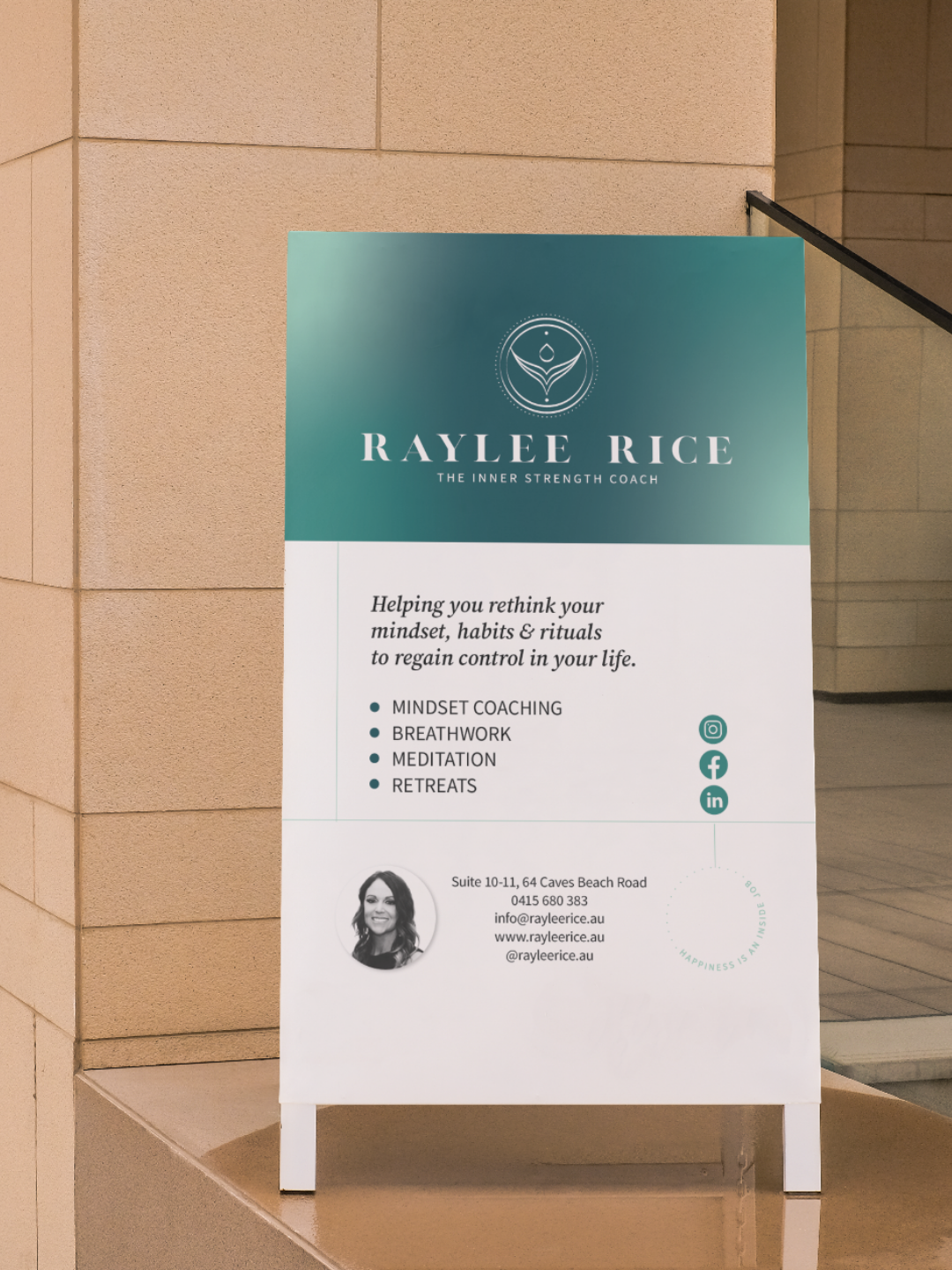
Raylee arrived to our first conversation like someone who had already decided. Deeply intuitive, commercially sharp, and completely clear on where she was heading. She had been running women's retreats for years and was ready to show up in the world at a level that matched her ambition.
The logo we created together for her as The Inner Strength Coach is one of our most symbolically rich pieces. A mandala-style composition drawing on visual elements that speak directly to Raylee's story, her practice, and the way she holds space for the women she works with. Nothing about it is arbitrary.
Since the rebrand in 2023, Raylee has expanded her business with more retreats, classes and a new space, and her profile continues to grow. The brand was built for exactly this kind of momentum.